...to Geog 353 Main Page and Course Description
...to Geog 353 Syllabus
...to Geog 353 Course Schedule and Lecture Outlines
...to Geog 353 Laboratory Information and Student Projects
We will review chapter 9 (Map Symbolization) & chapter 10 (Map Symbol Abstraction) from the Making Maps book. Additional information and examples can be gleaned from the material below.
Map Symbolization and Choropleth Maps
Once decisions have been made regarding the classification of the data you have to design an appropriate graphic symbolization of your data
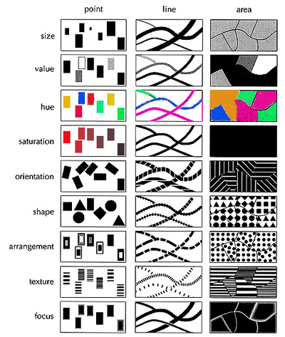
The visual variables are primary means of guiding cartographic symbolization
Abstract and Realistic Point and Line Symbols
Abstract point/line symbols: the symbol doesn't look like what it represents

Realistic point/line symbols: the symbol looks like what it represents

Most maps have a mixture of Abstract and Realistic Symbols:
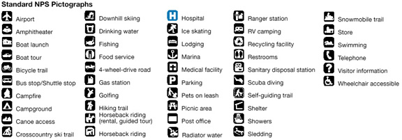
National Park Service Symbols
Introduction to Symbolizing Data in Areas
Symbolizing statistical thematic map data in areas is more complicated than data at points or along lines
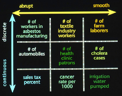
Phenomena Space:
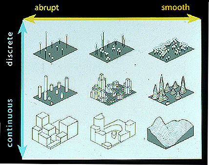
Two dimensions in "Phenomena Space"
Discrete versus Continuous variation
A continuum: phenomenon may fall at either end, or somewhere in between
Abrupt versus Smooth variation
Also a continuum: phenomena may fall at either end, or somewhere in between
Data examples in phenomena space:
The next step is to match this to an appropriate symbolization method...
Symbolization space: same dimensions as phenomena space graphic
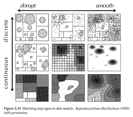
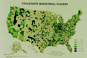
Representing discrete phenomena with smooth variation: us a dot map:
Representing discrete phenomena with abrupt variation: use a graduated symbol map:
Representing continuous phenomena with smooth variation: use a isarithmic map (surface map):
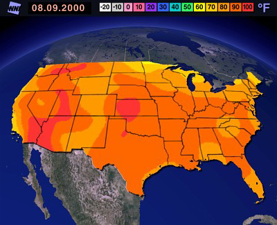
Representing continuous phenomena with abrupt variation: use a choropleth map:
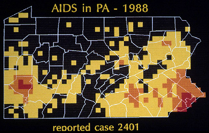
MacEachren fig. 3.25: AIDS data mapped with four different area symbolization techniques
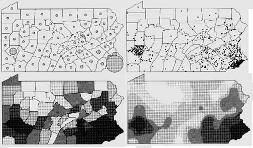
What to do?
It is ok to map the data with a choropleth map but it reflects the way the data was collected rather than the phenomena
But in reality AIDS as a phenomena is not so continuous (it isn't really everywhere) and it is not so highly contagious (like influenza or measles) as to be easy to catch with casual contact.
AIDS is actually a phenomena that is
Back to symbolization space: most appropriate is the middle technique: the "chorodot"
AIDS example is useful in that it reveals
Problem: you may not be able to easily choose the best area mapping method
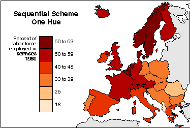
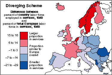
The Choropleth Map: Symbolizing Data in Areas
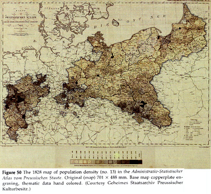
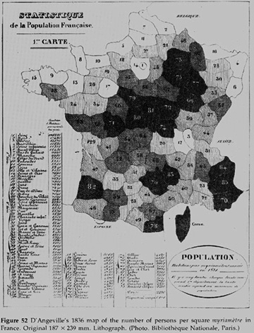
1. The Choropleth Map: Characteristics and History
When to use a choropleth map: symbolization space:
Choropleth map defined: "A method of cartographic representation which employs
distinctive shading applied to areas other than those bounded by isolines. These
are usually statistical or administrative areas." Dent.
The choropleth map is now the most common way to map areal aggregated data
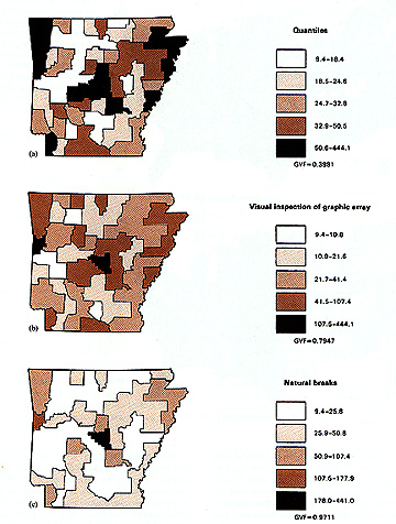
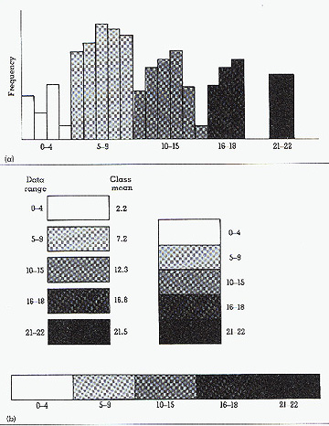
In most cases, the data is classified
Important question to ask in choropleth mapping: Is the data appropriate?
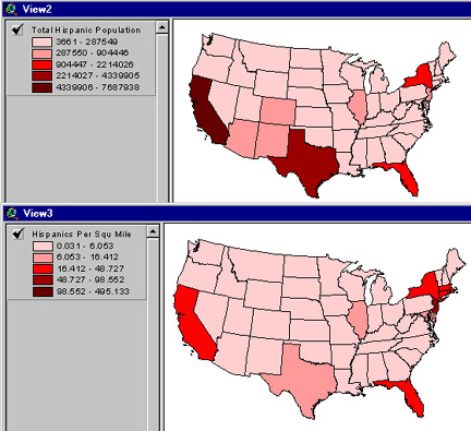
Mistake: using magnitude data for choropleth maps
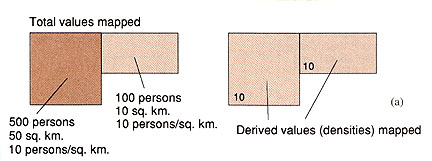
In most cases, the enumeration units on a map are unequal in area
Different view of data when looking at density versus totals:
Choropleth maps are optimal for:
2. Designing Choropleth Maps
Appropriate Legend Design
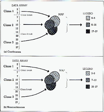
Range grading
Better to assign noncontinuous than continuous values in the legend
Appropriate Symbolization for Choropleth Maps
Several visual variables which can be used to differentiate the variations in data on a choropleth map, but value is the one that you should use for typical single variable choropleth maps
A few more choropleth map design guidelines
With printed maps most people tend to see dark as more, light as less
This may be different on computer screens, but the dark = more is a convention that you
should violate with caution
Also try and avoid white and black at the extremes of your range of values
Remember that most people can identify about 6 to 8 different values
Pay attention that the map projection is appropriate
E-mail: jbkrygier@owu.edu
...to Geog 353 Main Page and Course Description
...to krygier teaching page.
...to krygier top page.