...to Geog 353 Main Page and Course Description
...to Geog 353 Syllabus
...to Geog 353 Course Schedule and Lecture Outlines
...to Geog 353 Laboratory Information and Student Projects
Before beginning this ambrosial lab, you should have the following in ArcGIS:
Our next goal is to create graphic files in .png format (a higher quality graphic
file format that works in HTML and on the WWW). The means to this end is ArcGIS's
Layout view, where ArcGIS allows you to arrange your map, add titles,
legends, and export your maps to more generic graphic file formats (.gif, .jpg, .png, etc.). In Lab
9 you will animate the graduated color, symbol, and dot density maps and
prepare them for the WWW.
The Details:
1) As tidiness is still a virtue, create a new folder in your personal directory called PNG_Maps. You should save your files exported from ArcGIS (and eventually your animated .png files) in this folder.
2) Take a moment to think about where you are going with your maps: your graduated
color, graduated symbol, and dot density maps will be animated. All of the following should be decided
before you export your maps:
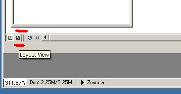
The Layout View in ArcGIS is the means by which you will export your maps, and provides functions for creating titles, legends, etc. Access it by clicking on the small page icon to the right of the icon for your data view in the lower left corner of your ArcMap window. A special Layout menu appears and there is also a Layout toolbar.
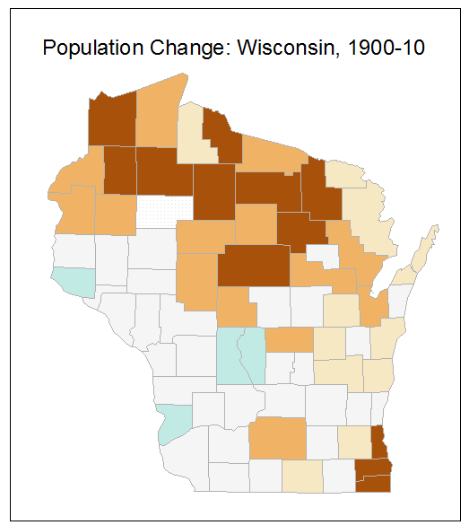
Start with your earliest population change map, 1900-10. All other layers should be off.
3) Once in the Layout View go to the Layout Menu and change the percent view to 100% to see the actual size of your map. Remember that your map, once exported, should fit on your web page - not too large or small. If the map is too large or small, change the scale (and size of the map) using the plus or minus magnifying glass tool in the main toolbar: this kind of magnification changes the actual scale of your map, so be careful to keep the two ways (layout vs toolbar) straight in your head.
4) While in Layout View go to the Layout Menu and change the percent view to 50% so you can see the entire page your map is on. Take care to use the Layout Menu percent view to change scale in the Layout View, and not the plus or minus magnifying glass icon in the main toolbar - the latter will change the scale of your map and you don't want that.
5) From the Insert menu select Title. Right mouse click on the title and select Properties. Give your map a relevant title (such as "Wisconsin Population Change, 1900-1910") and consider the type font you want to use for your final map. Review the type chapter in the Making Maps book. Keep the same font for your title, legend, and any other text on your map. Position the title in an appropriate place (probably above your map) and make sure the size is appropriate for the map size.
6) Go back to 50% in the layout view. From the Insert menu select Neatline.
7) While the neatline is still selected (blue boxes at corners) adjust it to fit around
your map and title. If you grab and adjust the Dataframe by
accident, the map will move: no good! undo! Once the neatline box encompasses your entire
map and title, without too much or too little white space around it, right-mouse
click on the neatline and select Properties. While in
Properties change the width of the neatline box to 1 point and the background
to None. You may need to adjust the size of the neatline again a bit.
8) Deselect the neatline by clicking in the white area off the page. Select 100% from the Layout menu. This is the size your map will be on your web pages. If it seems too large or small you can change the scale by using the magnifying tools on the main tool bar, but you will have to also adjust the title, legend, and neatline.
Don't worry about the legends for now.
Have your beloved instructor review the size of your map as well as the title, and neatline placement before you proceed. An example of an ok map size, title and neatline is below:
Exporting Your Maps
9) Once your neatline and title are in place (For your first map, Population Change, 1900- 1910 - and other layers turned off) go to File then Export map:
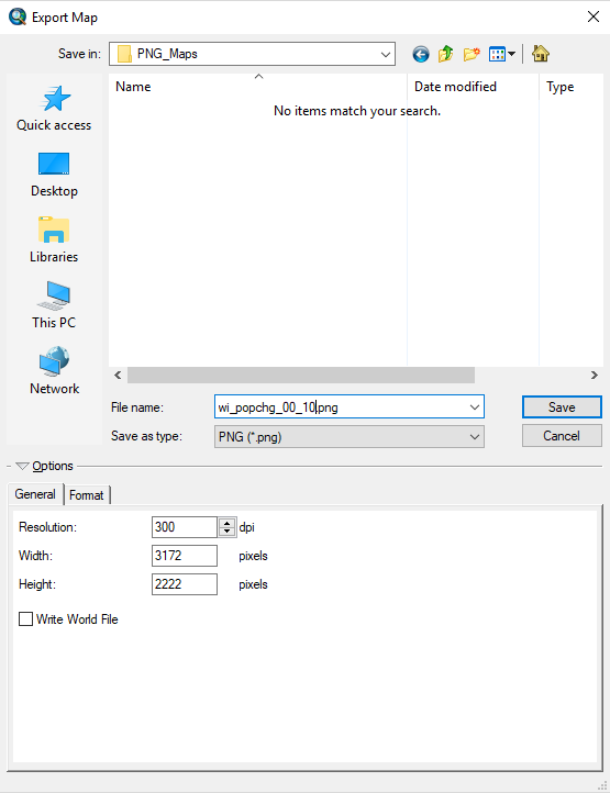
11) Following this procedure, export (to PNG_Maps) all of your choropleth (graduated color), graduated symbol, and dot maps. Do change the year for each map, but don't change anything else - just turn on a layer, export, turn it off and turn on the next layer and export, etc.:
12) Open each file in Paint. Use the select tool to select exactly on top of the neatline in Paint then Crop. If you
leave even a bit of extra space on the side, or are on the inside of the neatline, your maps
will wiggle around when animated. Save the cropped file in PNG_Maps folder.
Exporting Your Legends
The new version of ArcGIS makes it difficult to locate the legend at the exact location on each of the 12 or 13 maps you will animate. This means that the legend will wiggle around in the animation. Not good! Instead, let's just create one legend that we can export as a separate graphics file, and place next to our animation on the web page.
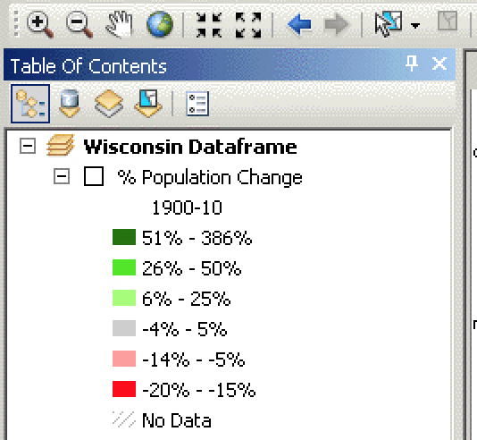
13) Double check that you removed decimals, added a % after each number (if it's a percent, and not if the legend has total numbers) and made sure larger numbers are at the top of the legend - using the Format Labels option.
14) While at 100% and viewing your 1900-1910 map: from the Insert menu select
Legend. Just hit OK for everything: you can go back and adjust details later (by
right-mouse clicking on the legend and selecting Properties). Move the legend below or
to the side of your map. The legend will probably be too large. Grab the corner of the legend
while it is selected and drag it smaller.
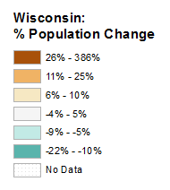
15) Double click on the legend. Under the General tab type Percent Population Change or add your state name: Wisconsin: % Population Change (you can also put the state name on a separate line, so a two line title). This will be the generic title for all 12 of the population change maps. Hit OK.
16) Right mouse click again on your legend. At the bottom of the Items tab in Legend Properties click on the Style button. This allows you to change the arrangement of the legend. Use the Horizontal Single Symbol Layer Name + Label option, as it gets rid of the data column header (such as chg_00_10) from the legend, while leaving the generic title we just added.
17) Move your legend so no other elements on the page are interfering with it. Export the map (with the legend) just like you did with the other maps (above). Open up Paint then navigate to your file. Grab the Select tool and draw a box around your legend. Hit Crop. Then Save your file as choro_legend.png It should look something like this:
18) Repeat with your graduated symbol and dot maps. You should end with three legends for
each of your three map types.
For your lab log note any prob lems you encountered and define the following:
E-mail: jbkrygier@owu.edu
...to Geog 353 Main Page and Course Description
...to krygier teaching page.
...to krygier top page.