Geography 353 Cartography and Visualization
...to Geog 353 Main Page and Course Description
...to Geog 353 Syllabus
...to Geog 353 Course Schedule and Lecture Outlines
...to Geog 353 Laboratory Information and Student Projects
Geog 353 Lecture Outline: Graduated Symbol Maps and Cartograms
Update: 7/1/04
Graduated Symbol Maps
Introduction
Previous Lecture: Introduction to Designing Symbols for Data in Areas
- discrete versus continuous dimensions in "Phenomena Space"
- abrupt versus smooth variation in "Phenomena Space"
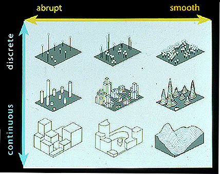
- From MacEachren
- match to discrete versus continuous dimensions in "Symbolization Space"
- match to abrupt versus smooth variation in "Symbolization Space"
- From MacEachren
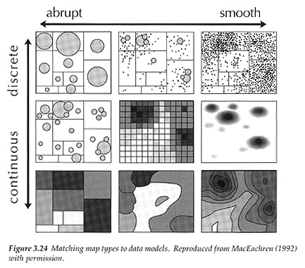
- Example: Mapping AIDS in Pennsylvania:
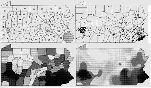
- Source: MacEachren
Given the same data (data in geographic units): four appropriate techniques
- representing continuous phenomena with abrupt variation: choropleth map
- choropleth = graduated color map (in ArcGIS)
- representing discrete phenomena with smooth variation: dot map
- dot map = dot density map (in ArcGIS)
- representing continuous phenomena with smooth variation: isarithmic map
- representing discrete phenomena with abrupt variation:
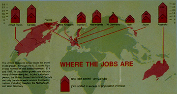
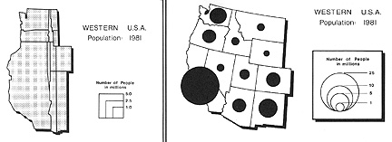
- graduated symbol map
- graduated symbol map = proportional symbol map (in ArcGIS)
- range graded graduated symbol map = graduated symbol map (in ArcGIS)
- cartograms (variation on the graduated symbol map)
1. Graduated Symbol Maps: Characteristics and History
- Source: Robinson
Graduated symbol maps
- also called proportional point symbol mapping
- variable point symbol mapping
- ArcGIS: Graduated (classed) vs Proportional (unclassed) symbol maps
When to use a graduated symbol map:
- discreet phenomena (data) with abrupt variation
- use anytime you want to show relative magnitudes of phenomena
- Source: Monmonier
Should be magnitude data
- ex) whole numbers rather than derived (eg., not densities: use choropleth)
- ex) total population, retail sales, total employment...
The graduated symbol map uses one symbol, of which the visual variable size
varies with the quantity of the data, for each area on a map
- easy to interpret and frequently used
History of the Graduated Symbol Map
William Playfair developed the first use of graduated symbols in 1801 but
not on maps
- Playfair used circles: still the most common shape
- Playfair scaled the symbol areas (rather than diameters or circumferences) to
the data quantities - and this method also persists to date
First use on maps by Henry Harness, August Peterman, and Minard (1850s):
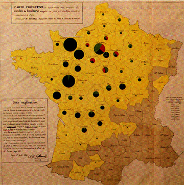
- Menard Graduated Circle Map (1858) (Source: Robinson)
Slow to be adopted in the United States: first show up in academic books and
articles in the early part of 1900s
2. Designing Graduated Symbol Maps
- Basic design issues with graduated symbol maps
2a. Symbol Shape and Graduated Symbol Maps
Circles are most common and have the longest history, but almost any
other shape you can think of can and has been used
- Graduated Bars
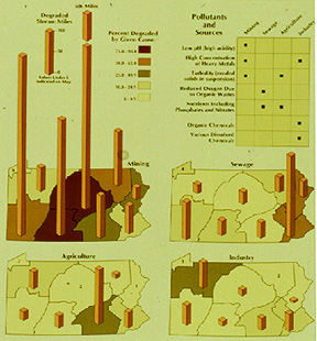
- Graduated Bars
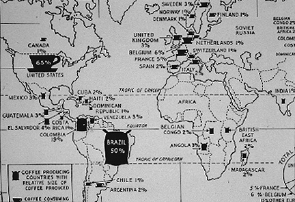
- Graduated Coffee Cups and Bags
Problem: bars and other symbol shapes can be more difficult to compare
and relate to each other than circles
- Source: Dent fig. 8.3
- Compact circles, squares, and triangles are the easiest to interpret
- The area of such symbols are scaled to the magnitude of the data values
Circles have some advantages over other symbols
- the most compact symbol
- circle scaling is easy (vs. scaling coffee cups): use square root of the radius
- circles are more 'visually stable' than most other symbols
- circles have a more subtile, smooth feel (vs pointy edged squares, triangles)
It is also possible to have 3D symbols: cubes, prisms, triangles
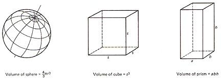
- Source: Dent fig. 8.4
- scale the volume to the cube root of the data
- drawback: difficult to judge relative volumes
Demo) ArcGIS: graduated/proportional symbols
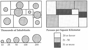
2b. Symbol Scaling and Graduated Symbol Maps
- Two basic ways to scale graduated symbols:
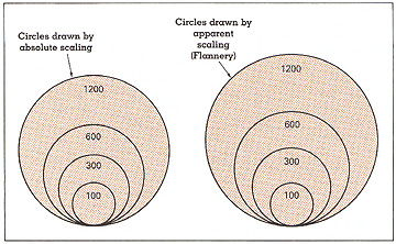
Absolute scaling: pick a minimum and maximum size and scale each of the symbols to
the particular data values associated with an area on the map
Important to have a sense of what is happening here; but few people calculate
graduated symbols by hand anymore: automated
Perceptual scaling: scaling adapted to take into account human perceptual
abilities; also called apparent magnitude scaling
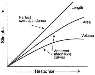
- ArcGIS Proportional Symbol window: Appearance Compensation (Flannery)
- Source: Dent fig. 8.5
Other problems with graduated circles: visual illusions
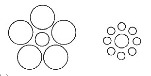
- Source: Dent fig. 8.7
When a circle is seen among smaller circles, it is perceived as about 13%
larger than if the same circle is seen among larger circles
Graduated squares are somewhat easier to calculate but are not quite as easy to
interpret as circles because they are not as compact
- Source: Dent fig. 8.9
- squares do not have the perceptual problems of circles
- people do not underestimate the area of squares as they do with circles
Range grading
In ArcGIS: Graduated Symbol Map
Another option when scaling graduated symbols is to classify the data and come up with 4
to 6 different graduated symbol sizes (or more, or less)
- Source: Dent fig. 8.12
- the benefits of classification: easy to pick out what class a symbol falls into
- although you lose some of the detail in the map: all the fine gradiations in
data are not visible
Demo) ArcGIS: Graduated Symbol Map (classified)
2c. Graphic Design Guidelines for Graduated Symbol Maps
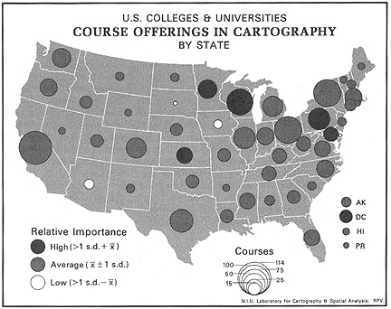
Multivariate Graduated Symbol Maps: there are benefits to displaying more information
on one map than the same amount of information on a series of maps (comparison problems).
- ex) size of symbol represents one variable, value represents 2nd variable:
- ArcGIS???
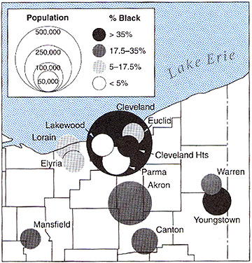
- Source: Robinson fig. 25.10
- ArcGIS: graduated symbol map over choropleth map (and problems)
- But: potential problem with symbol overload
- Multi-variate Graduated Triangles (Japan Economic Data) and
Circles (Dent 8.14)
Chernoff Faces: variation on the graduated symbol theme: many variables for each symbol:
2d. Manual vs Computer Production of Graduated Symbol Maps
- Manual graduated symbol map production: tedious
- much easier with computer aided graduated symbol maps
- can set the smallest and largest circles you want and the rest are calculated
- can have different abstract shapes (but often not realistic shapes)
- can have transparent vs opaque (value, hue) symbols
- and can classify (range grade) if you want to
- ArcGIS and Graduated and Proportional Symbol Maps
Summary
1. Graduated Symbol Maps: Characteristics and History
- when to use a graduated symbol map:
- discreet phenomena (data) with abrupt variation
- use anytime you want to show relative magnitudes of phenomena
2. Designing Graduated Symbol Maps
2a. Symbol Shape and Graduated Symbol Maps
- abstract (circles, squares, triangles) vs. realistic symbols
- volumetric symbols
2b. Symbol Scaling and Graduated Symbol Maps
- absolute scaling
- perceptual scaling
- range grading
2c. Graphic Design Guidelines for Graduated Symbol Maps
- symbol overload, symbol redundancy
2d. Manual vs Computer Production of Graduated Symbol Maps
Introduction: Cartograms
- Symbolization Space: use with same data appropriate for graduated symbol maps
- From MacEachren
Cartograms are a broad and curious bunch of mapping techniques
- Source: Dent
Cartograms, while geographically 'inacurate' are ideal for representing some
kinds of data in areas:
Most common: the "value by area" cartogram
- There are many other kinds of cartograms, and they have a long history
1. Cartograms: Characteristics and History
- The fundamental characteristic of cartograms is that the visual variable "location" is not
linked to actual geographical coordinates
- Any kind of map that purposefully uncouples location (of points, lines, areas) on a
map from actual geographical location is a cartogram
Linear Cartograms
Examples) Transportation cartograms
- transportation maps - and particularly subway and road maps - often rearrange linear
information to stress and simplify the relations between different routes
- the idea is that such a linear cartogram is easier to use than a map of the transportation
routes which is based on the actual location of the lines
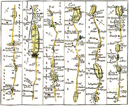
- Road Linear Cartogram
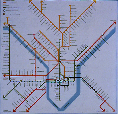
- Subway Linear Cartogram
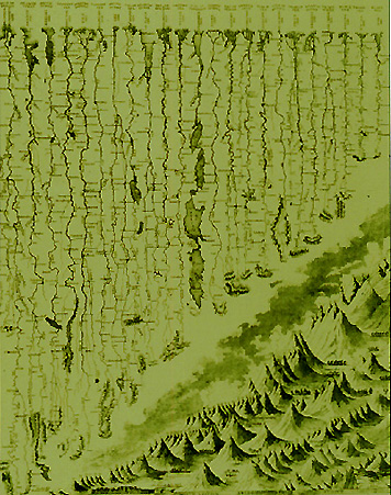
Example) World rivers and mountains cartogram:
- longest rivers get straightened out and arrayed next to each other
- tallest mountains get put together in their own virtual mountain range
- Subway Linear Cartogram
Area Cartograms
- Raisz Area/Volumetric Cartogram
Area cartograms are the most common
- early area cartograms (the direct precursor to the value by area cartogram) first show up in
French textbooks in the 1860s - very diagrammetric
- Erwin Raisz (cartographer at Harvard 1930s) promoted them in his textbooks
- later cartograms were less abstract: value by area cartograms
- the narrow sense of the term "cartogram:" a map where the size of the enumeration unit is
scaled to some measure other than geographical area
- greatly distorts geographic area, orientation, and contiguity, but
preserves enough of these for the are to be recognizable
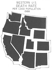
When to use a cartogram of this type: usually an alternative to graduated circle map
(abrupt and discreet; magnitude values); sometimes an alternative to the choropleth map.
- Source: Tyner
- Source: Pictorial Maps
Typically unclassified: each enumeration unit scaled to value
Why use: strong visual impact: they draw attention to themselves and if created carefully
are easy for people to understand
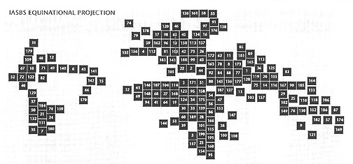
- Equinational Projection (Source: Globehead!)
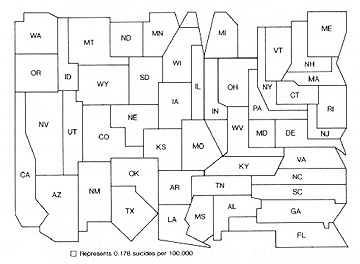
- Suicide rate, USA (Source: Dent)
Watch out for inappropriate data
- the data varies as the size of the enumeration units
- ex) big states have big values; small states small values
Cartograms are an important and under-appreciated mapping technique
Erwin Raitz (1930s): "Value by area cartograms are important. Our socioeconomic
overview of the world will be more realistic if we think of the relative
importance of its parts in the proportions of a population cartogram rather than
in the proportions of a map."
- Source: Dorling
Daniel Dorling (discussing population area cartograms, 1990s): "The majority of the
population of most countries live in small, densely populated areas which need
numerous insets on a map to give any semblance of justice." "Regular" maps are
"equal land maps" and they "draw our attention to the patterns in places where
the fewest people live." Cartograms are more appropriate for "seeing how
something is distributed spatially across groups of people"
2. Cartogram Forms
- two basic cartogram forms: contiguous and noncontiguous
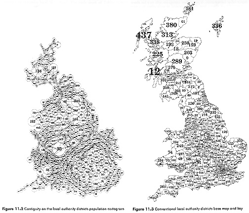
- Contiguous vs Noncontiguous Cartograms (Source: Dent fig. 10.3)
Contiguous cartograms: the enumeration units on the map are adjacent to each
other, even though contiguity may be distorted. They attempt to preserve topology.
- use a contiguous cartogram if you have phenomena that is abrupt and continuous
- replacement for a choropleth map
Advantages
- boundary and orientation relationships maintained which strengthens the
relationship of the cartogram to actual geographic space
- less work for the map reader (does not have to mentally pull the map together)
- shape of the mapped area closer to actual geographic space
Disadvantages
- actual boundary relationships may be distorted and give map reader erroneous
impressions (eg., certain states may be adjacent on a cartogram when they
are not adjacent in actual geographic space)
- in attempting to keep contiguity, the shapes of the units may have to be greatly
distorted with a resultant loss or recognizability
- difficult to construct
- hard to automate
- avoid using a contiguous cartogram if you have to wildly distort the enumeration units
- Contiguous cartogram: Miliary Spending
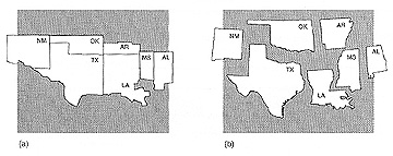
Noncontiguous cartograms: does not preserve boundary relations among the
enumeration units on the map; units located in approximate actual locations
(in relation to other units) with gaps inbetween
- sort of an "exploded" view
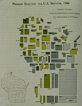
- Non-contiguous cartogram: Wisconsin Election
- problem: familiarity with the geographic relations of the areas mapped
- use a noncontiguous cartogram if you have phenomena that is abrupt and discreet
- replacement for a graduated circle map
Advantages
- easier to scale and construct (than contiguous cartograms): can automate
- actual shapes of enumeration units can be preserved (WI looks like WI)
- somewhat easier to compare varying sizes and judge differences
Disadvantages
- does not convey the contiguity of actual geographic space (abstract)
- not compact and hard to maintain the shape of the entire area mapped
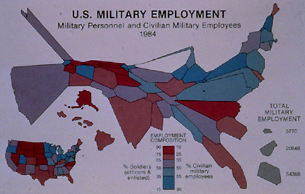
3. Multi-variate Cartograms
As with other area data mapping techniques, we show two data variables by combining a
cartogram with a graduated symbol or choropleth map.
- use the size of the enumeration unit to represent one distribution of phenomena, and the
value of each unit to represent another (slide)
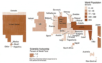
- Bi-variate cartogram: Population (value) and Authorship
(cartogram)
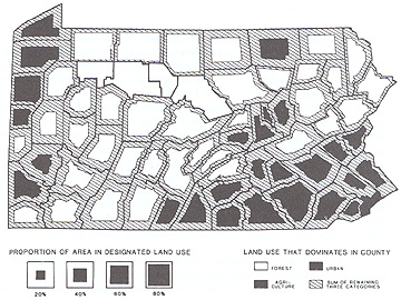
- Bi-variate cartogram: Dominant Land Use (shading) and Proportion of land
use (cartogram)
4. Cartogram Production
Manual Methods: olde time cartogram construction
- somewhat akin to the absolute scaling of graduated symbol maps
- easy to do with noncontiguous cartograms
- just scale each enumeration unit to the appropriate size and arrange
- harder to do with contiguous cartograms
- have to figure out the size of each unit based on the data being mapped
- complicated process of preserving the shape of each unit while scaling to the
appropriate size and keeping contiguity intact
- frustrating and difficult to do well (and thus not done very often)
Computer Methods
Easy to create noncontiguous cartograms: simple scaling like with graduated
symbol maps then location decisions are made (try to get as close to the
actual location without overlap)
- Non-contiguous cartogram (Source: Tyner)
More difficult to create contiguous cartograms: but some software exists which
creates such cartograms (Daniel Dorling)
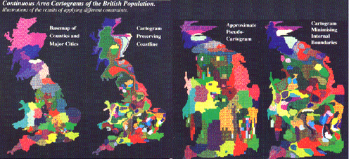
- Contiguous cartogram (Source: Dorling)
Hybrid Cartogram with Chernoff faces: Dorling:
Summary: Cartograms
- overview of advantages and disadvantages of cartograms
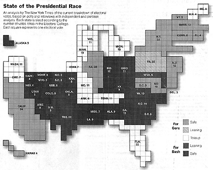
- States Scaled to Number of Electoral Votes (Source: New York Times)
Advantages
- can be used to good effect to "shock" a viewer; since most people seem to quickly grasp
the nature of the technique, it is effective for making the user pay attention to the map
- may be a more effective way of representing data that varies inversely with enumeration
unit sizes
- effective in showing distributions of phenomena that would be otherwise obscured;
particularly important when there is a wide variation in enumeration unit sizes
(US with Texas vs Rhode Island)
- allows the data that is the focus of the map to drive the representation, rather than the
geographic area of the enumeration units
Disadvantages
- some people may feel the data is "inaccurate" because the map base seems to be
inaccurate
- some people may be confused by the method; need to explain what you have done if
you think the audience may be confused
- difficult to identify specific locations or enumeration units on cartograms
- hard to design very effective cartograms
E-mail: jbkrygie@owu.edu
...to Geog 353 Main Page and Course Description
...to krygier teaching page.
...to krygier top page.
OWU Home
OWU Geology and Geography Home