Geography 353 Cartography and Visualization
...to Geog 353 Main Page and Course Description
...to Geog 353 Syllabus
...to Geog 353 Course Schedule and Lecture Outlines
...to Geog 353 Laboratory Information and Student Projects
Geog 353 Lecture Outline: Type on Maps
Update: 10/13/19
We will review chapter 11 (Type on Maps)
from the Making Maps book. Additional information and examples can be gleaned from the
material below.
- Making Maps Ch 11. Type on Maps
Introduction
The role of typography in cartographic design
- like color: issues and guidelines applicable to mapping, GIS, WWW pages
- typography as a visible and readable language in all these mediums
- closely related to the issue of symbolization
Type plays a large role in shaping the look and communicative abilities of a map
- another graphic variable map makers have control over
Four major issues
- introduction to the functions and uses of type on maps
- introduction to the basic elements of type
- the type variables: style, size, weight, and form
- overview of type placement principles
1. Functions of Map Lettering
- Four general functions of typography on maps:
1. Type on maps used for naming and labeling
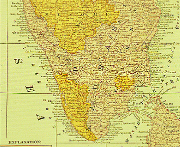
- Labeling on map of India
- Importance of type placement for clear and unambiguous communication
2. Type on maps used to organize
- Labeling structures the information on a map and the map itself
- type provides an important structure for any graphic
- type variables can be manipulated to give order and hierarchy
- link to map's intellectual hierarchy
- akin to the visual variables: quantitative vs qualitative variations
3. Type on a map used to explain
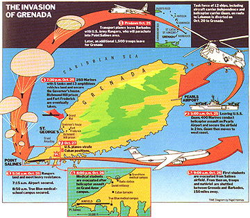
- Time Magazine map of the Invasion of Grenada
- cannot explain everything on a map with graphics alone
- titles, legends, blocks of explanatory text
4. Type on a map used to impart "visual atmosphere"
- Type which looks 'historical' on an historical map
- achieve different impressions with different typography
- historical vs contemporary 'look'
- usually subtile but important way to manipulate the look of a map
Project WWW Pages: effective use of type for naming, organizing, explaining, visual
atmosphere
- ex) change font to change the whole look and feel of your WWW pages
Consider typography to be another map symbol: it can be used to represent
more than what the word means
- Columbus >> Columbus
- Columbus >> Columbus
- Columbus >> Columbus
- Columbus >> Columbus
- Columbus >> Columbus
The use of typography on a map has two broad facets
- 1) What the word means: the content and meaning of the words
- 2) What the type looks like: type as a graphic symbol
- bigger vs smaller type,
different type faces and forms
- typo-graphic variations should be used to mean something
2. The Elements of Type
- thousands of typefaces (fonts)
- how to select an appropriate typeface or font
- first: understand the anatomy of type
Typeface Characteristics
Type face or font: complete set of all characters of one size and design of a typeface
- the difference between helvetica and palatino and
times and courier
- in HTML: FONT FACE="name"
Type family: variations on a single typeface
- Dent 14.5: Type Family: Cushing
Letterform Components:
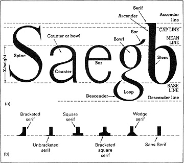
- Dent 14.1: Type Elements
- baseline:
- x-height:
- ascenders:
- descenders:
- capline:
- counters, bowls, loops
The serif: finishing strokes added to the end of the main letter strokes
- bracketed
- unbracketed
- square
- bracketed square
- wedge
- sans serif
Key concern about type in cartography: the individual letters (and words)
should be easily identifiable
- Difficult: type spread out over map, over different backgrounds, oriented in
different ways, interrupted by lines and other graphic elements; type itself may
have different tones, patterns, colors.
- All this and the type has to be readable
Look at some of the ways we can manipulate type to make it work on maps...
3. Typographic Variables and Cartographic Design
Four typographic variables and associated design issues
- 1. Type Style
- 2. Type Size
- 3. Type Weight
- 4. Type Form
Typography on maps can be effectively used to differentiate
1. qualitative (nominal) data
- type style
- type form (spacing, italics)
2. quantitative (ordinal, interval/ratio) data
- type size
- type weight
- type form (case, value)
1. Type Style and Cartographic Design
The history of type design and type style
- helps to understand the different 'looks' of type styles
Prior to printing presses most letters and words were created by hand
- textura
- early movable type replicated these hand drawn letters
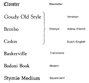
- Dent 14.8: Type Classification
Black Letter or Gothic: 1400s: movable type designed to look like hand lettering
- avoid on maps (hard to read); used on diplomas
Oldstyle or Oldface: late 1400s to 1700s: designed to help with printing
- black letter was smudgy in printing
- Goudy, Bembo, Palatino
- redesign to hold up better when printing text
- a mellow, restful, dignified feel
Transitional: 1700s: bridge between oldstyle and modern type
- light hairline and rounded serif
Modern: late 1700s: modification of transitional
- straight line serif, more "modern looking"
- clean, abrupt, dynamic, unsettling, dazzling feel
Sans Serif Styles
- 19th century development of sans serif forms
- even more modern looking
Type style implies qualitative (nominal) differences
Summary...
Consider two basic type styles
1. serif type: type with those little thingamabobs (serifs):
- ex) Times has Thingamabobs
2. sans serif type: type without those little thingamabobs (san serif):
- ex) Helvetica has no Thingamabobs
Type style is best used to symbolize qualitative information:
- ex.) serif type used for the historical information on a historical map
- ex.) sans serif type used for water features on historical map
Type style may also be used to symbolize the "look and feel" of the map:
- ex.) serif type tends to imply tradition, dignity, and solidity
- ex.) sans serif type tends to imply newness and precision
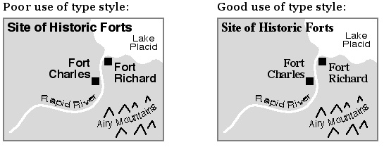
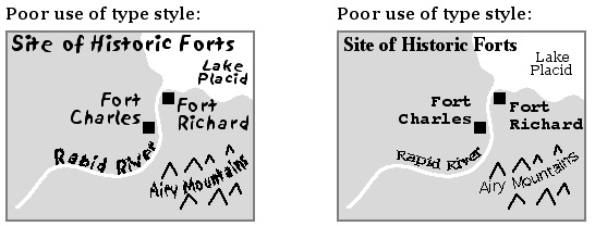
- Type Style: Good and Poor Uses
Details on design considerations of type style...
- Type Style and Personality
- type creates a feel, moods, and this can be taken advantage of on maps
- baskerville: beauty, quality, urbanity
- bodoni: formality, aristocracy, modernity
- caslon: dignity, character, maturity
- century: elegance, clarity
- cheltenham: honesty, reliability, awkwardness
- franklin gothic: urgency, bluntness
- futura: severity, utility
- garamond: grace, worth, fragility
- standard: order, newness
- stymie: precision, construction
- times roman: tradition, efficiency
- It is usually not advisable to combine two or more type styles on a map,
except if you want to create a somewhat disjointed, excited feel for the map
- Carefully evaluate compatibility if serif and sans serif type styles are combined on one
map: some combinations are not appropriate (such as the modern looking Helvetica and the
older looking Palatino).
- A more appropriate combination might be Stone Sans Serif and Stone Serif
- Typefaces that accidentally work together: geometric modern typefaces and sans serif
- Avoid combining two serif or two sans serif type styles on one map
- Serif type is easier to read in blocks of text
- notice that most books are set in serif type styles
- Serif type easier to read as the letters are more distinct
- will make discernibility a bit easier if there is no other reason to use san serif
- Avoid decorative type styles (such as Gothic) except in rare instances - they are often difficult to
read and draw undue attention to themselves.
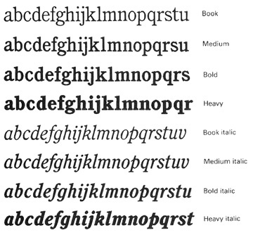
2. Type Size and Cartographic Design
The way type size is determined is based on the way type was originally produced
- metal, or foundry blocks
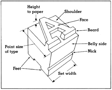
- Dent 14.4: Foundry Type Character and Terminology
Type size determined by height of the foundry block
- in points (1 inch = 72 pts)
- is not the same as the height of the letter!
- compare same point size of two different faces
- ex.) same point size, different font, different real size
- ex.) same point size, different font, different real size
- other parts: shoulder, face, beard, belly side, nick, set width
Type size variations imply ordered (quantitative) relationships
Summary...
- Larger sizes imply more importance or greater quantity
- ex) Madison
- Smaller sizes imply less importance or less quantity
- ex) Waukesha
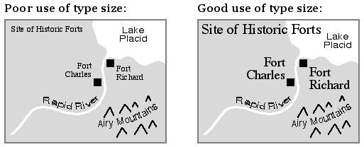
- Type Size: Good and Poor Uses
Details on design considerations of type size...
- Avoid using type less than 6 points in size as it will be difficult to see; type larger
than 24 points is too large for most maps.
- Smaller type sizes are harder to interpret; check that the type you plan to use is
readable at small sizes; that it is possible to distinguish c and e or i and j and that the
type does not close up at small sizes
- Use a 2 point difference in small type sizes and 3 point difference in medium and
larger type sizes in order to distinguish between two sizes of type.
- Most people have difficulty distinguishing any more than 5 categories of data
symbolized by type size on a map.
- Different output media
- 300 dpi printer vs 1200 dpi printer
- paper (can be smaller) vs computer screen (must be larger)
- as viewing distance increases, type size must also to remain legible
3. Type Weight and Cartographic Design
The use of light (not always available), regular, and bold type weights implies quantitative (ordinal,
interval/ratio) differences
Summary...
- bold type implies a greater quantity than regular type
- ex) bold for county names; regular for township names on state map.
- light type implies a lesser quantity than regular type
- ex) population categories: 10 pt. regular >> 10 pt. bold >> 12 pt. regular >> 12 pt. bold
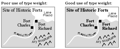
- Type Weight: Good and Poor Uses
Details on Design considerations of type weight...
- Bold type may imply power and significance; it draws attention; yet some bold type
looks fat and a bit silly
- Bold and regular as easy to find on a map (avoid bold unless it symbolizes something)
- Light type may be difficult to see
- If you feel the urge to underline type, STOP; use bold instead
- Printing: light breaks up; bold closes in
- Size variations better than bold/regular to show quantitative order
4. Type Form and Cartographic Design
Type form can imply qualitative (nominal) and quantitative (ordinal, interval/ratio) differences.
Summary...
Case: UPPER CASE vs. lower case
- why called case?
- ex) qualitative: MOUNTAIN RANGES upper case
- ...other natural features lower case
- ex) quantitative: STATE NAMES in upper case
- ...county names in lower case
Tint: black vs. grey vs. red
- ex) quantitative: background information grey...foreground information black
- ex) qualitative: red vs green
Italics vs plain type forms
- ex) qualitative: water features in italics
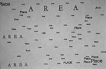
Spacing: condensed vs. e x t e n d e d
- ex) qualitative: appropriate for naming a r e a f e a t u r e s
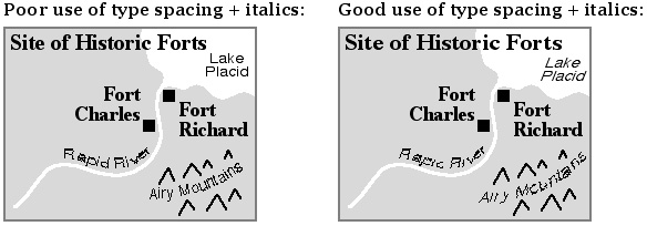
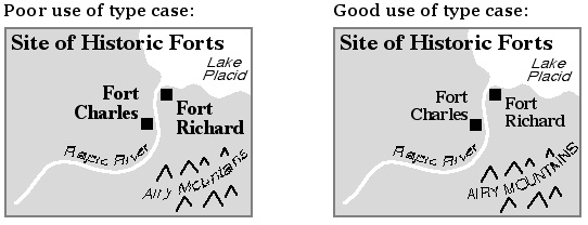
- Type Form: Good and Poor Uses
Details on design considerations of type forms...
...on Case
- Dent 14.11: Upper and Lower Case
- lettering in all upper case is hard to read
- lettering in all lowercase is easier to read
- has to do with "silhouette" (see figure above)
- avoid all caps if possible
...on Tint
- the use of grey type must be carefully considered; small type is hard to see if it is grey;
the ability to see the difference between more than 2 levels of grey type (not including black)
may be impossible.
- if using colored type, follow visual variables recommendations (hue for qualitative differences,
value for quantitative, ordered differences.
- if type is to be legible over a dark background then using white type (often called
reversed type) is advised
- WWW and colored type
...on Italics vs. Plain (Roman)
- convention dictates that italics is used for natural features and regular type is
used for cultural features.
- italics is harder to read: avoid except where conventional: water features
...on Spacing
- narrow type may look too squashed together to read at small sizes.
Arcview Demo: Type Style, Size, Weight, Form
4. Explanatory Text and Type Placement on Maps
4a. Explanatory Text
Explanatory text explains the content and purpose of a map:
Explanatory Text on a Map
- Map titles should clearly communicate the location, content, and temporal context
of the map. A subtitle may be used.
- Map titles should be placed in the upper left corner of the map, where most map
readers first look at a map.
- A block of text may help to explain the context, function, or patterns seen on a
map. Placement in the upper left part of the map will insure that the
explanatory text is read prior to looking at the map.
- Include text which describes the data source, the date of data collection and
publication, and the map projection used. Place this text towards the bottom of
the map.
4b. Type Placement
Effective type placement clarifies the relationship between a label and the
symbol (point, line, area) to which it refers.
Labeling Point Features
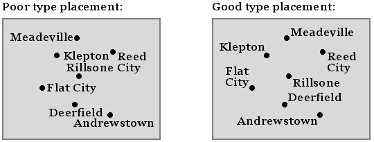
- Poor and Good Type Placement when Labeling Points
When labeling point symbols on a map, start at the center of the map and work
outward.
- For each symbol, follow these priorities (1 = best, 8 = worst):
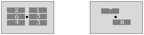
- Priorities for labeling Points
Type placement should reflect characteristics of the location being labeled:
- label ports and harbor towns on the sea
- label inland towns on the land
- label land features on land; water features on water
- label towns on the side of river they are located
- align type to graticule if graticule is included
- Poor and Good Type Placement when Labeling Points
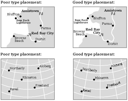
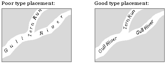
B. Labeling Linear Features
- rivers, streets, streams, rails, paths, etc.
When labeling lines, curve or slant the type to follow the symbol
- Focus on three goals: above, horizontal, and repeat
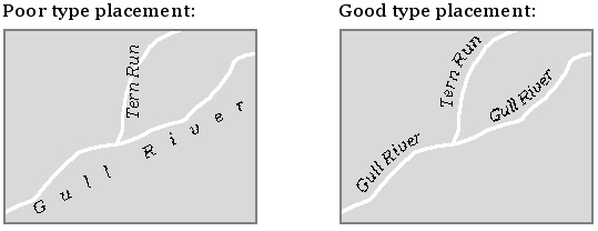
- Poor and Good Type Placement when Labeling Lines
Since there are fewer type descenders than ascenders, place labels for linear
symbols above the symbol; fit the descenders into the symbol
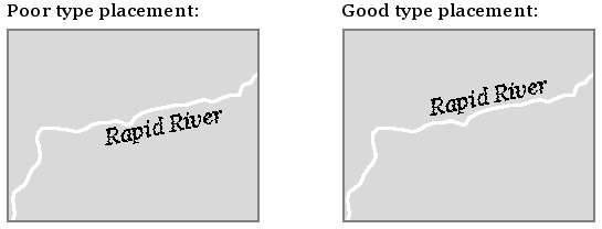
- Poor and Good Type Placement when Labeling Lines
Horizontal type is easiest to locate and read. Never place type upside down. If
vertical, place first letter of label towards bottom of map
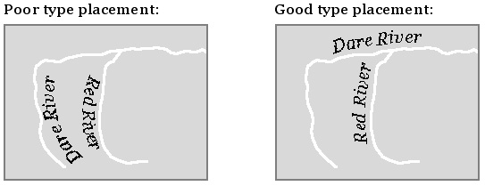
- Poor and Good Type Placement when Labeling Lines
Repeat, rather than space out label along a linear symbol
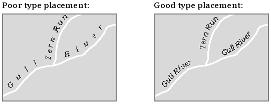
- Poor and Good Type Placement when Labeling Lines
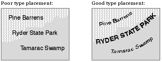
C. Labeling Areal Features
- states, oceans, filled areas on maps
When labeling areas on maps, curve and space the type to fit the areas to ensure
that the area and the label are clearly associated.
- entire area label should follow a gentle and smooth curve
- keep area labels as horizontal as possible (easier to read)
- avoid vertical and upside down labels (harder to read)
- keep labels away from area borders
- avoid hyphenating or breaking up area labels
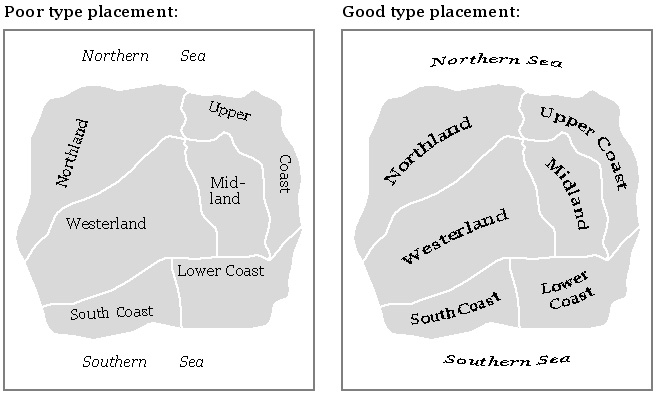
Poor and Good Type Placement when Labeling Areas
Overlapping areas can be distinguished by varying type variables such as size,
weight, and form.
- Poor and Good Type Placement when Labeling Areas
Linear areas should be labeled like line symbols.
- Poor and Good Type Placement when Labeling Areas
Conclusions
Technological change in typography
Extremely easy to manipulate typography on maps given computer technologies
Ten years ago: type set on typesetter
- now: flexibility of digital type
- Dent 14.21: Bitmapped (raster) vs scalable (vector) type
Bitmapped or screen type (raster)
- what you see on the screen; can get the jaggies
Scalable or outline (vector) type
- much more flexible
- postscript fonts: each letter is defined by points, lines
- advantages
- can convert to lines/points and adjust
- device independent
- don't get jaggies
- can be skewed, twisted, curved easily
Digital Type: Much easier to use the guidelines outlined above
E-mail: jbkrygier@owu.edu
...to Geog 353 Main Page and Course Description
...to krygier teaching page.
...to krygier top page.
OWU Home
OWU Geology and Geography Home