Geography 353 Cartography and Visualization
...to Geog 353 Main Page and Course Description
...to Geog 353 Syllabus
...to Geog 353 Course Schedule and Lecture Outlines
...to Geog 353 Laboratory Information and Student Projects
Geog 353 Lecture Outline: Color on Maps
Update: 10/13/19
We will review chapter 12 (Color on Maps) from the Making Maps book.
Additional information and examples can be gleaned from the material
below.
- Making Maps Ch 12. Color on Maps
Introduction
Color is fundamentally important to cartography and fundamentally confusing
- In the past: traditional printed maps: expensive and difficult to use color
- Given current computer technology, color is seldom NOT an option
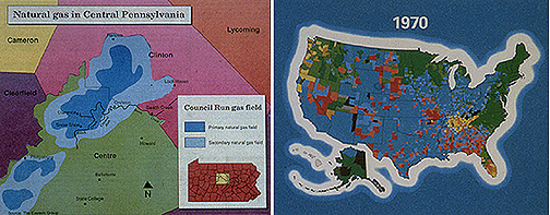
- Bad Map. No Donut.
Mark Monmonier: Color as a cartographic quagmire: why?
- "I do not advance that the face of our country would change if the maps
which Philadelphia sends forth all over the Union were more decently
colored, but certainly it would indicate that the Graces were more
frequently at home on the banks of our lovely rivers, if the engravers were
able to sell their maps less boisterously painted and not as they are now,
each county of each state in flaming red, bright yellow, or a flagrant
orange dye arrayed, like the cover produced by the united efforts of a
quilting match. When I once complained of this barbarous offensive coloring
of maps, the geographer assured me that he would not sell them unless
bedaubed in this way; 'for, said he, the greatest number of the large maps
are not sold for any purpose of utility, but to ornament the walls of
barrooms. My agents write continually to me to color high.' This reason
was given me by one of the first geographers of the United States, who has
himself a perfectly correct idea of the tasteful coloring of maps."
--from Francis Lieber, "On Hipponomastics: A Letter to Pierce M. Butler,"
Southern Literary Messenger 3 (5) (May 1837): 297-300.
- color is confusing and there are no specific standards
- many different ways to specify colors
- color is often misused with new technologies
- there is a lot that you can do with black and white
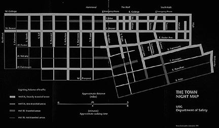
- State College PA Night Map
Discussion of color and cartography:
- 1. An Introduction to Basic Color Terms and Perception
- 2. The Complexity of Color Use
- 3. Color and Cartographic Design
- 4. Color Hue and Color Value on Choropleth Maps
1. An Introduction to Basic Color Terms and Perception
1a. How Do We See Colors?
Color perception issues: the sensing and understanding of color: three elements
1. Characteristics of the light source
- colors will vary as the light source varies
- incandescent vs florescent, low light vs high light intensity
- design issue: under what kind of light source will your map be viewed?
2. Characteristics of the surface of the map
- colors will vary as the surface of the map varies
- glossy paper vs rough paper vs computer screen
- design issue: what kind of surface is the map presented on?
3. Characteristics of Human Color Perception
Humans are sensitive to a small band of electromagnetic energy which is
called visible light
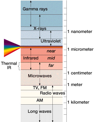
- McKnight 2-23: Electromagnetic Energy Spectrum
Using color for cartographic design requires an understanding of how people
perceive color
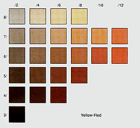
- Dent Plate 7: Munsell Plate: the dimensions of color perception
Human color perception consists of...
1. hue: names for psychological experiences of particular electromagnetic wavelengths
- humans can perceive millions of different hues
- visual variables: hue suggest qualitative differences
2. value (lightness): perceived lightness and darkness
- easy to understand in a chromatic (color) or achromatic (greys) series
- humans can perceive thousands of variations in value or lightness
- visual variables: value suggests quantitative differences
3. saturation (chroma): amount of pure hue in a color relative to neutral grey
- ex) radishes and tomatoes
- visual variables: saturation suggests both qualitative and quantitative
differences
1b. How Do We Create Colors?
Color production issues
We create colors in ways that are often different from the way we perceive colors
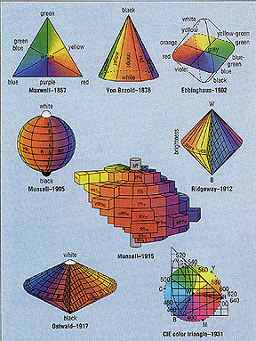
- Dent Plate 12: Various Color Specification Systems
Color specification systems: schemes which organize and help produce different
colors. There are numerous ways to organize and produce colors, all of which are
used by cartographers and graphic designers.
Most color specification systems provide some kind of unique identifier for
each different color in the system: they help specify unique colors for
printing and for computers
Three categories of color specification systems you need to be familiar with:
A. Perceptual Color Systems: based on how humans see colors
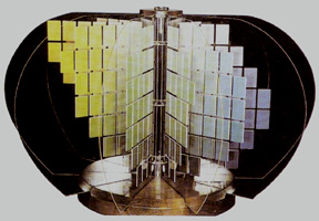
- Dent Plate 1: Munsell System
Munsell Color System: a three dimensional color space which is based on hue,
value, and chroma/saturation; each color chip is differentiatable by the average viewer
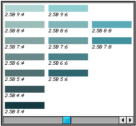
- Munsell Computer Palette: hue/value/saturation
- ArcGIS Demo) Hue, Value, Chroma/Saturation in AV
B. Predefined Color Systems
Pantone Matching System: series of preselected colors which are available to
commercial printers; you select a color and the printer obtains the correct ink
mixtures
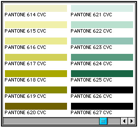
- Pantone System
Use Pantone when you are going to have a map printed by a commercial
printer. Also provides a diverse palette of colors.
- ArcGIS Demo) Specific Color Palettes in AV
C. Process Color Systems: the use of varying amounts of 3 primary hues to
produce all other colors
Different for color production in printing vs on computer screens
C1. Process color systems for printing (commercial printers)
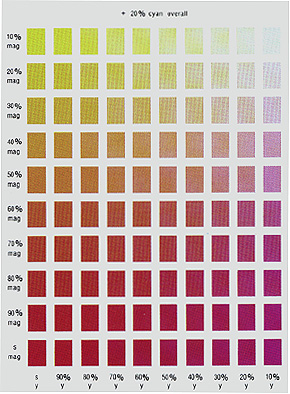
- Process Color Chart: 20% cyan and varying % of yellow and magenta
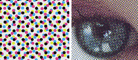
- Dent Plate 11: Process Print Closeup
You can get a broad range of colors (hue, value, chroma) based on varying
combinations of cyan, magenta, and yellow
- ex) 40% yellow, 10% cyan, 5% magenta = unique color
Color Primaries
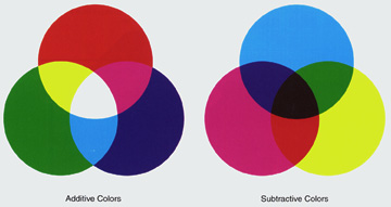
- Color Primaries: additive and subtractive
Cyan, magenta, and yellow are called the subtractive primaries
- when all three are combined, they subtract (absorb) all light resulting in black
Subtractive Primaries are the most common system used in printing
- printed colors reflect light and you see color
Problem: if you want black you can get it by combining 100% of cyan,
magenta, and yellow, but resulting color is a very dark brownish color
- therefore black is added as a fourth 'color' to overcome this problem
- CMY(K): cyan, magenta, yellow, black
- PHOTOSHOP DEMO) Subtractive Primaries
C2. Process color systems for computer screens
- Color Primaries: additive and subtractive
RGB: red, green, blue are called the additive primaries
- when all three are combined, they add (reflect) all light resulting in white
You can get a broad range of colors (hue, value, chroma) based on varying
combinations of red, green, and blue
- Robinson: Close up of computer monitor
- PHOTOSHOP DEMO) Additive Primaries
Additive Primaries the most common system used in creating color on computer screens (and
computer printers)
- displayed colors project light and you see color
Color specification in HTML: Hexidecimal Color Specification System
- A means of describing RGB in hexadecimal digits:
- two digits for red, two digits for green, and two digits for blue
- 00 is black (absence of color) and FF is maximum intensity.
- range of values from light green to dark
- 00FF00: no R, max. G, no B
- ex) 00FF00 >> 00EE00 >> 00DD00 >> 00CC00 >> 00BB00 >> 00AA00 >> 009900 ...
Many excellent Color HTML sites on the WWW:
2. The Complexity of Color Use
2a. Color Interacts with its Environment
Simultaneous contrast: the appearance of any color in a display depends
on the colors that surround it
- Robinson 21.1: Simultaneous Contrast
This is an artifact of the way our brain interprets color
Carefully pre-selected colors (selected independently of each other) will often
look different when combined on a map
Little we can do about it except to carefully evaluate the way colors interact
together on a map
Successive contrast: colors are modified based on the order in which they are seen;
related to simultaneous contrast
- ex) look at orange symbol, then black symbol, then orange

- Successive Contrast
Visual acuity: monochromatic backgrounds (one hue) make it easier to pick out
colors than mixtures (such as brown)

- Visual Acuity
Advance and retreat: perceptual phenomena whereby reds seem to advances
(stand out more) and greens and blues seem to retreat (fall back more) in the visual plane

- Hypsometric Effect
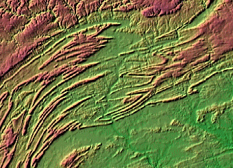
- Hypsometric Effect: Relief Map
- Hypsometric Effect: convention to use this effect to enhance relief on maps
- problem with emotive effects (dry/wet)
Why does advance/retreat happen? Our eye physically adjusts itself a bit when perceiving
longer wavelength reds and this seems to produce this effect; very subtile
- high values seem to advance and low values seem to retreat
- high saturations seem to advance and low saturations seem to retreat
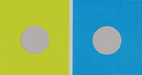
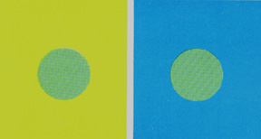
Individuality of Hues
- some hues look "individualistic" and others look like mixtures

- Individuality of Hues
- ex) blue + yellow = green but green does not look like a mix
- ex) red + yellow = orange and orange does look like a mix
Implications:
- phenomena which is distinctive should use individualistic hues
- phenomena which is mixed should use mixture hues
Color location, size, and shape: colors will seem to vary as their location,
size, and shape varies
Implications of all of these issues: color cannot be selected independent
of its context
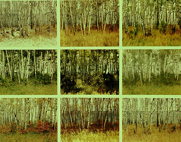
2b. Changing External Conditions Affect Perception
The appearance of any color in a display varies as the lighting conditions of
the room the display is in change
- incandescent vs florescent lighting
- dim vs bright lighting
- turn room light on and off and notice colors change on wall maps
Color varies as the settings of one computer monitor vary
Implications:
- for printed maps: try and take into account the viewing conditions if known
- most important if dim lighting conditions are expected
- for computer displays look at your display on different monitors, and make sure
you look at it on the one your map will be used on
2c. Physiological Differences among Individuals
The appearance of any color in a display varies based on who is viewing it
Young children (less than 5 yrs old) seem to understand only a limited set of hues, and have difficulty
arranging different color values in any kind of order
- preference for warm hues such as reds and greens
- switch to preference for cold hues (blues) later in life
- trouble with highly saturated hues (which is common on kids maps)
- trouble with highly unsaturated hues
Older people are less sensitive to color and need brighter (saturated) colors
- older people lose the ability to perceive blue
Color blindness in 3% of females and 8% of males (red and green look same)
- using colors that are colorblind safe
...finally: color use is complex because...
- Tufte: Seasons
2d. Color has Symbolic and Emotional Connotations
The meaning we get from different colors varies
- culturally determined in many instances
Our culture has conventional meanings for different colors
- blue: water, cool, positive numerical values, serenity, depression, melancholy,
truth, purity, formality, depth, restraint, loneliness
- green: vegetation, lowlands, forests, youth, spring, nature, envy, greed,
jealousy, cheap, ignorance, peace
- red: warm, important items (roads, cities...), action, life, blood, fire,
heat, passion, danger, power, loyalty, bravery, anger, excitement, warning
- yellow/tan: dryness, lack of vegetation, intermediate elev., "hot",
cheerful, dishonest, youth, light, hate, cowardice, joy, optimism, spring, strong,
warning
- orange: harvest, fall, abundance, fire, attention, action, warning
- brown: landforms (mountains, hills...), contours, cozy, dull, reassuring,
depressing
- purple: dignity, royalty, sorrow, despair, richness, elegant
- white: purity, clean, faith, illness
- black: mystery, strength, heaviness
- grays: quiet, reserved, sophisticated, controlled
Implications: use these conventions to match phenomena with color
3. Color Hue and Color Value and Choropleth Maps
"Appropriate use of color for data display allows interrelationships and patterns
within data to be easily visualized. the careless use of color will obscure these
patterns."
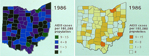
- Poor and Good use of Color Value on Choropleth Map
Brewer's guidelines are derived from two sources
- long history of graphic design experience: the 'art' of cartography
- but also perceptual/cognitive studies: the 'science' of cartography
In essence: we want color use to be as intuitive as possible
- user does not have to think about the symbolization
- but can focus on the patterns on the map
Brewer's Color Guidelines
General rule of thumb: hue for qualitative differences, value (lightness)
for quant/ordered
1. One Variable Color Schemes
- for single-variable choropleth maps: most common
1a. Qualitative Schemes: qualitative difference in data
- represent with differences in hue, holding value constant
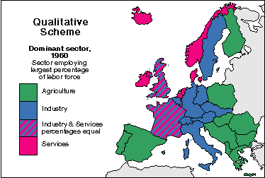
- Brewer: Qualitative Color Scheme (Hue)
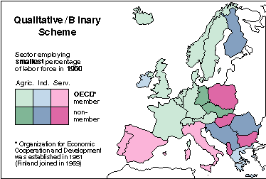
1b. Binary Schemes: qualitative difference in data
- represent with differences in value, holding hue constant
- unique case: using value to represent qualitative difference
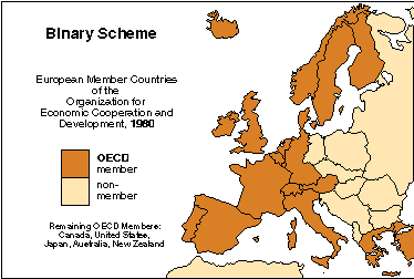
- Brewer: Binary Color Scheme
1c. Sequential Schemes: some order or sequence in the data (quantitative)
- represent with differences in value, holding hue constant
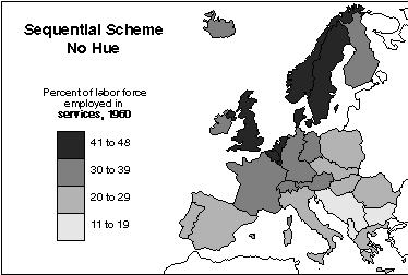
- Brewer: Sequential Color Scheme: Monochrome
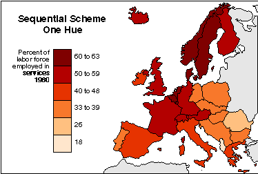
- Brewer: Sequential Color Scheme: Chromatic (single hue)
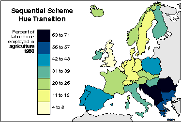
- Brewer: Sequential Color Scheme: Chromatic (multiple hue)
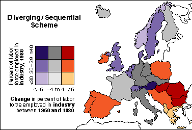
1d. Diverging Schemes: importance focused on a mid point and variations out from
that midpoint
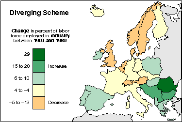
- Brewer: Diverging Color Scheme: Chromatic (green/yellow)
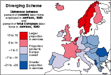
- Brewer: Sequential Color Scheme: Chromatic (red/blue)
Two and Three Variable Color Schemes
- For representing two and three data variables at the same time
- Less common, harder to interpret, but more sophisticated
- For more sophisticated users
- Can create such color schemes in ArcGIS manually (custom colors)
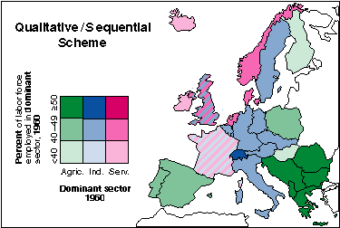
- Brewer: Two Variable Color Scheme: qualitative/binary
- Brewer: Two Variable Color Scheme: qualitative/sequential
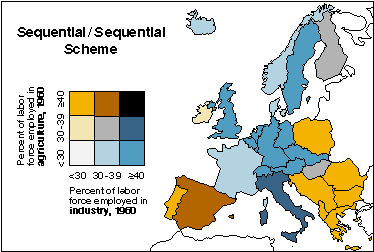
- Brewer: Two Variable Color Scheme: sequential/sequential
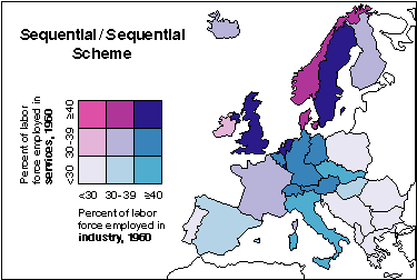
- Brewer: Two Variable Color Scheme: sequential/sequential
- Brewer: Two Variable Color Scheme: diverging/sequential
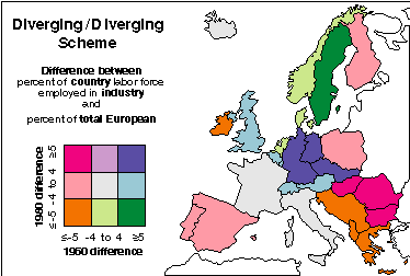
- Brewer: Two Variable Color Scheme: diverging/diverging
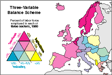
- Brewer: Three Variable Color Scheme: diverging/diverging/diverging
Summary
An overview of the many issues surrounding the use of color to represent information
1. An Introduction to Basic Color Terms and Perception
How Do We See Colors?
- light source, surface, and perceptual issues
How Do We Create Colors?
- color specification systems
2. The Complexity of Color Use
- Color Interacts with its Environment: simultaneous and successive contrast,
visual acuity, advance and retreat, individuality of hues, color location, size,
and shape
- Changing External Conditions Affect Perception: lighting conditions and
computer monitors
- Physiological Differences among Individuals: children, elderly, colorblind
- Color has symbolic, emotional, and affective connotations
3. Color Hue and Color Value and Cartographic Design
Brewer's scheme whereby the perceptual dimensions of color correspond to
logical organization of the mapped data
Color misused more than other visual variables
Remember: variations and changes in color should mean something
- avoid gratuitous use of color
- attempt to correlate variations in the data with logical variations in color
Avoid creating your own cartographic quagmire!
E-mail: jbkrygier@owu.edu
...to Geog 353 Main Page and Course Description
...to krygier teaching page.
...to krygier top page.
OWU Home
OWU Geology and Geography Home