Geography 222 The Power of Maps
...to Geog 222 Main Page and Course
Description
...to Geog 222 Syllabus
...to Geog 222 Course Schedule
...to Geog 222 Exercises
Geog 222 Exercise 6: Census Atlas of Home
Revised: 4/18/03
- ASSIGNED in class Monday, November 17
- DUE: Decision on scale and detail of maps in class Wednesday November 19
- 5 of 10 maps DUE for discussion: in class Monday, December 1
- DUE: in class Friday, December 5 (group discussion of results)
- Exercise Worth: 50 pts
Introduction:
This exercise involves making and interpreting choropleth maps of U.S. Census
data in the area around your home.
You will draw upon past lecture material about data classification and
color symbolization (in the
Cartographic Abstraction Lecture Notes) to complete this exercise.
You will also be expected to interpret the patterns you see on the maps
you create, based on what you know about your home.
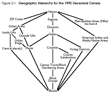
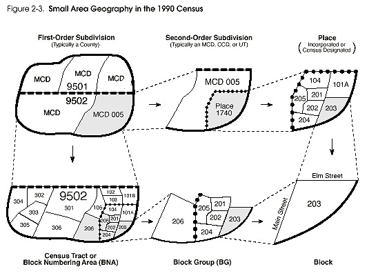
Basic Information about the U.S. Census
The U.S. Census collects data at the block level - usually an area about
the size of a city block. In rural areas these 'blocks' are somewhat larger in
size (they contain about the same amount of people as a city block). For
privacy reasons, much of the U.S. Census data is not available at the block
level, but is available at the Census Block Group level (the data from
numerous blocks are aggregated into a larger area). The following
graphics illustrate the hierarchy of census geographic entities, and are taken
from the U.S. Census
Geographic Reference Manual which has much more information about
U.S. Census Geography if you are interested.
After the 1990 US Census, the Census Bureau implemented the TIGER Map Service
(TMS) as an experiment in providing detailed Census data and maps to the public
via the internet. The TMS site still exists, and can be used to map 1990
data.
According to the Census Bureau, the main purpose of the TMS site was to
provide high-quality, national-scale, street-level, interactive maps to users of
the World Wide Web.
The TMS site was developed for two main reasons:
- 1.There is a demand from many users and developers on the World Wide
Web for easily-accessible street-level and regional maps for places in the United
States, whether for general viewing, research and analysis, usage in interactive
map-based services, or inclusion as illustrations in documents. The Census
Bureau, as the nation's only maintainer of a national public-domain street level
database, was the most obvious candidate as a provider of such a service.
2.The U.S. Census Bureau, as a federal government agency, is required by the
Freedom of Information Act to provide the information it gathers freely on
a cost-recovery basis. The Bureau was interested in finding ways to disseminate its
geographic and statistical data more efficiently at less cost to the public. This
project represents an effort to make the Census geographical data more accessible
and more useful.
At some point the Census Bureau's development and support of the TMS site came
under attack (suggesting how WWW mapping can become a political issue).
This is suggested by certain comments found at the TMS FAQ page.
One source of flack seems to have come from other governmental agencies and
private organizations and companies who found the TMS site to be useful, but
lacking certain functions: these organizations wanted additional functions and
even access to the software code. The Census Bureau did not have the resources
to provide for development of the TMS site and public access to the code. The
other source of flack came from private internet map providers, who saw the
Census TMS site as unfair competition. The US Government, the argument goes,
should not be providing services that private organizations could provide.
To address these issues, the Census Bureau contracted out the development of a
new WWW application for distributing information gathered in the 2000 Census.
This new site, called American
Factfinder has more functions than the TMS site it replaces, but seems a
bit more convoluted (so please be patient!). We will be using the American
Factfinder for this exercise.
Goals: You will map out ten different Census data variables, around
your home, and provide basic map
reading, analysis, and interpretation of patterns on these choropleth maps.
Procedure:
Open two windows in Netscape (or some other internet browser); one for
this exercise and one for the American
Factfinder page. You will need to refer to this exercise in the process
of using the
American Factfinder page.
1) Go to the U.S. Census Page and select
American Factfinder from the list of resources on the left side of
the page. You can also go directly to the
American Factfinder WWW page at the US Census WWW site.
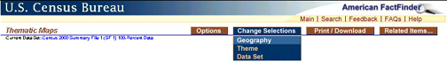
2) Once you arrive at the American Factfinder select Thematic Maps
from the bottom of the screen. You should see a map of the US with basic
population data.
The first thing to learn is how to change the geographic area on the American
Factfinder site: you want to zoom into the area around your home. Changes in
the area you are viewing and scale are called Geography.
3) The American Factfinder site offers different ways to change scale.
For now do this...
- from the Change Selections menu, select Geography:
- A new page (like below) allows you to set the area you want the Factfinder to map.
- Please select County Subdivision (as below).
- Please set State, County, and Geographic Area to your home
(the following shows selections for my home):
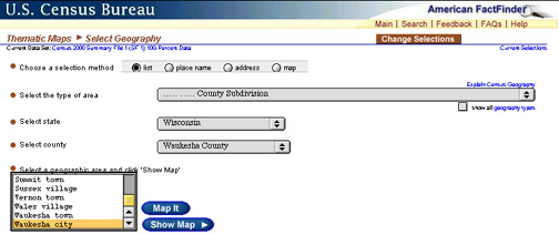
- Hit Show Map
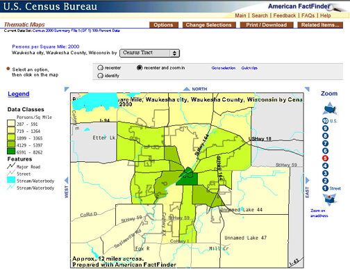
- You should see a map of the area you just selected as below, which is of
my 'home'. The
map should have basic Geography (roads, boundaries, rivers, etc.)
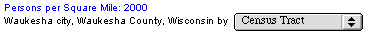
and should also have basic population data mapped out (the Thematic
data) at a Census Tract level.
- If the area covered by the thematic data is not the area around your
home, you need to repeat this step and select the correct Geography. The
eventual goal of this exercise
is to look at different Census data variables around your home, so you
need to be looking at data that is near your home. If you are having
trouble at this stage you must talk to your instructor for help.
4) Change the level of detail of the Census Data. From the pop-up menu:
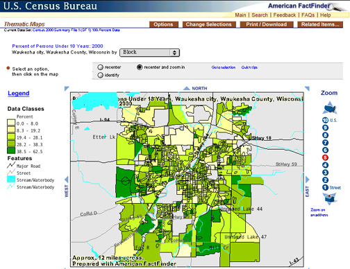
- ...select Block and you should see something like this:
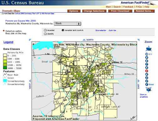
- Block level data is the most detailed. The patterns are similar
to the patterns on the Census Tract but with more detail. Most of you will
use Block level data for the rest of your exercise. If you are from a
large city, you may have to use less detailed data, at the Block Group or
Census Tract scale. If you are having difficulty at this state, please
consult your kindly instructor.
- At this point, you may want to zoom into the map to be able to see a bit
more detail. Click on the map to zoom in and recenter. Don't zoom in
too much: you want maps which show the variation in Census data in at
least a few mile radius of your home.
Now that you know how to change the geographic area shown on the American
Factfinder site, you need to learn how to look at the different data variables
the US Census collects. These data variables are called Themes.
5) The American Factfinder site offers different ways to change data
themes. For now do this...
- from the Change Selections menu, select Theme:
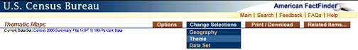
- You will arrive at a page like the one below. Select Show all Themes to
get a list of all US Census Data variables you can map:
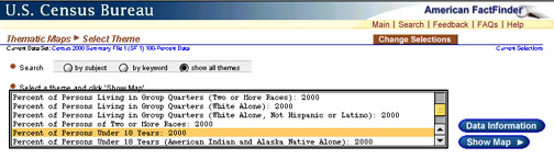
- Review the list of Themes. There are many of them! Select one that
seems interesting to you and then Show Map. I selected the Percent
of People under 18 Years: 2000 and got this map:
- You will eventually select TEN different themes and, in essence,
make a Thematic Atlas of Home using the American Factfinder
site and the U.S. Census 2000 data. All of the maps should be the
same scale.
Now that you know how to change the theme and geographic area shown on the American
Factfinder site, you need to learn how to adjust the Data Classification and
what features are shown on your map. This can be accomplished by adjusting the
Legend.
6) Click once on the word Legend on the left side of the screen. A
new smaller window should pop up.
- You can adjust how the data is classified here. If you make
changes, click Update to apply the changes to your map:
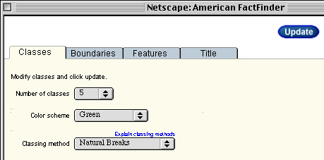
- Number of Classes: 5 is a good default, but you can
select 2 to 7 classes.
- Color Scheme: select what you like best.
- Classing Method: Review the notes from class (in the Cartographic Abstraction
Lecture Notes). Also, select Explain Classing Methods
on the pop-up page for on-line information. Briefly:
- Natural Breaks: best default: statistically determines natural
'gaps' in the data and places the class divisions at those places.
- Equal Interval: Same numeric interval for each class.
- Quantile: equal number of data values in each class.
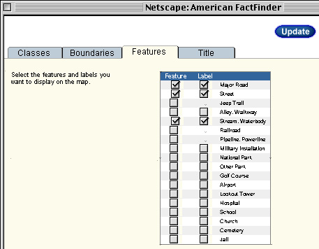
- You can also adjust which features are mapped by selecting the
Features tab and checking the features you want displayed. If you make
changes, click Update to apply the changes to your map:
- Finally, the Title tab allows you to change the title of the
map if you so choose.
You now know how to change the theme and geographic area shown on the American
Factfinder site, as well as how to adjust how your data is classified and
what features are shown on your map. The American Factfinder site does
more than this, but these are the basics you need to complete this exercise.
The ultimate goal of this exercise is to make a Census Atlas of Home using
the American Factfinder site and the U.S. Census 2000 data. Before you
begin this task, please do the following:
- Double check that you have selected an appropriate scale for your
maps. If you
are zoomed in too much you will not get a good sense of how the data you are
looking at varies around your home; if you are zoomed out too much you will
not get a good sense of the details of the data you are viewing close to
home. Generate five maps and show them to your instructor (Monday April
21 in class) so he can evaluate
your choice of scale.
- Think about how you select a classification scheme and number of classes:
recall the problems with quantiles and equal interval schemes.
Be prepared to defend the classification scheme you select.
- Make sure you select interesting data themes to map. Don't just choose
the first ten on the list. Think about interesting characteristics
of your 'home' and look at those variables. Explore more than ten themes and
select the one's that have interesting variations or that raise questions in
your mind. If little variation is evident when you map out a variable, select
another variable. Boring maps lose points.
- Please complete and print at least 5 maps of different themes
for an in-class discussion on Monday April 21. We will discuss the
entire exercise in class on Friday April 25 (when the exercise is due).
7) Generate 10 different maps of ten Census themes for your
Census Atlas of Home. Each should have the same scale and US Census
data level (eg., Blocks) and each should have the same features (roads, rivers,
etc.)
- Save each map using the right-mouse-button trick (right mouse button
click and hold on the map, then select "Save Image as..."). Save the legend
for each map in the same way (do be careful to keep the correct legends and
maps together!). If you have problems with this please contact your
instructor.
- Include printed maps and legends in the materials you turn in for
this exercise. Remember that you have access to the GIS Lab (M-F, 8:30-5)
to print your maps. You can print your maps in black and white if you don't
have easy access to a color printer.
8) Finally: do some basic map reading, analysis, and interpretation for each
map. This should be easy for most of you to do as you are familiar with the place
on the maps. An example of what you need to do follows, based on this map of
your instructor's home:
Type up the following information for each map. I recommend including the
name of the map (what data variable is mapped) Correctly cited, the map, its legend, and the map
reading, analysis, and interpretation you write up on one page. Thus you should
turn in 10 pages total. An example follows, showing how much you should write
for each map:
8a. Map reading: process of determining what the map maker has depicted
- ex) A choropleth map of the city of Waukesha, Wisconsin, showing the
Percent of Persons under 18 years old, in 5 classes, classified by natural
breaks.
8b. Map analysis: process of seeing spatial patterns on the map
- ex) In general, the further you move away from downtown
Waukesha, the higher the percent of people under 18. Distinct
low areas in the north-central part of town, and in a few blocks
in the extreme south part of town, and directly south of downtown.
Distinct high areas in the west, south-east, and north-east areas
away from downtown. Mid-level areas in many of the areas surrounding
downtown. The particular block where my parents live has a mid-level
of persons under 18 years old.
8c. Map interpretation: explaining the patterns noticed in the map
analysis; note low areas, medium areas, and high areas; note things that
surprised you and explain patterns based on what you know about your home.
- ex) These patterns are explained in several ways. The general
pattern of a higher percentage of people over 18 living in the areas
away from downtown is easy to explain: more families with children
live in the suburban areas of town, than live downtown. Specific very
low blocks are areas that are not residential: some low blocks downtown
are largely commercial and have few houses or apartments; some low
blocks to the south of town are industrial parks, again with few places
for anyone to live (looking at a map of general population in the area
shows that few people live in these areas). High areas are explained
by several factors: some are new subdivisions, which appeal to families
with children. Also, the Census blocks around the three high schools in
town have higher percentages of people under 18 - people with kids live
near schools. I was surprised that there were relatively low numbers of
under 18 persons in many of the older residential areas of Waukesha.
This is probably because many of the homes in these areas - built in
the 1960s - are owned by couples who's children, like myself, no longer
live at home: empty nesters. It may be the case that these folks will
sell their homes to young couples before the next Census, and these
areas will show higher percentages of people under 18 in the 2010
Census as a result.
Please describe why you chose the classification scheme and number of
classes you used for your maps (1 paragraph).
What is Due
Please turn in your Ten Map Census Atlas of Home with your maps (correctly
cited) and their
legends and your map reading, analysis, and interpretation for each map.
Remember that we will take some class time to discuss the results of this exercise
on the day it is due. You will use these maps in your take home final exam.
E-mail: jbkrygie@owu.edu
...back to krygier top page.
...to krygier teaching page.
...to geography 222 exercise page.
OWU Home
OWU
Geology and Geography Home